The Base Element
All layout and content elements derive from a base element. The base element contains common properties shared across all elements
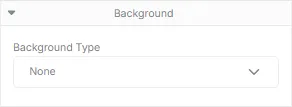
Background
Section titled “Background”Controls the graphics that make up the background of the element. An element can have either a solid color or an image as a background. The settings for the element’s background change based on the selected background type.
Sets the background for the element to a solid color.
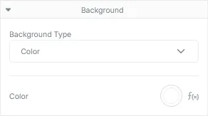
Background Color Properties
Section titled “Background Color Properties”| Field | Description |
|---|---|
| Color | Sets the solid background color for the element. |
Sets the background for the element to an image. If the provided image is larger than its element, the image will be scaled down while maintaining its ratio.
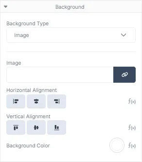
Background Image Properties
Section titled “Background Image Properties”| Field | Description |
|---|---|
| Image | The image asset that will be rendered in the background of the element. An image can either be selected from the list of Assets uploaded to the account, or set to a property within the JSON payload. |
| Horizontal Alignment | The horizontal alignment of the background image. This property will only have an effect if the element is wider than the given image. |
| Vertical Alignment | The vertical alignment of the background image. This property will only have an effect if the element height is larger than the height of the given image. |
| Background Color | Allows a solid color to fill the element’s background behind the given image. |
Padding
Section titled “Padding”Controls the spacing between the element’s internal content and its border graphics.
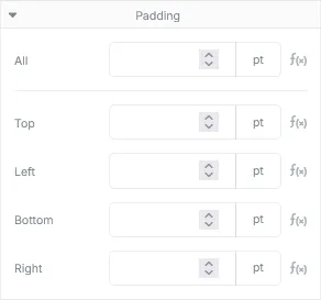
Padding Properties
Section titled “Padding Properties”| Field | Description |
|---|---|
| All | The amount of all-round space between the border and the element’s content. |
| Top | The amount of space between the top border and the top of the element’s content. |
| Left | The amount of space between the left border and the left of the element’s content. |
| Bottom | The amount of space between the bottom border and the bottom of the element’s content. |
| Right | The amount of space between the right border and the right of the element’s content. |
Margins
Section titled “Margins”Controls the spacing between the current element and the elements directly adjacent to it.
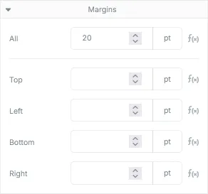
Margin Properties
Section titled “Margin Properties”| Field | Description |
|---|---|
| All | The amount of all-round space between the element’s border and the content surrounding it. |
| Top | The space between the element’s top border and the content immediately above it. |
| Left | The space between the element’s left border and the content left of the element. |
| Bottom | The space between the element’s bottom border and the content immediately below it. |
| Right | The space between the element’s right border and the content right of the element. |
Borders
Section titled “Borders”Controls the graphics that surrounds the edges of the element.
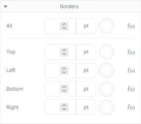
Border Properties
Section titled “Border Properties”| Field | Description |
|---|---|
| All | The width and color of every edge of the element. |
| Top | The width and color of the top edge of the element. |
| Left | The width and color of the left edge of the element. |
| Bottom | The width and color of the bottom edge of the element. |
| Right | The width and color of the right edge of the element. |
Miscellaneous
Section titled “Miscellaneous”Controls the miscellaneous properties that can be applied to the element.
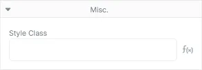
Misc. Properties
Section titled “Misc. Properties”| Field | Description |
|---|---|
| Style Class | A space delimited list of style classes that should be applied to the element. |
Dynamics
Section titled “Dynamics”Controls the templating logic applied to the element. Available logic operations are Loop, Simple Condition and Complex Condition.
Allows the targeting of an array within the JSON payload in order to drive the repeated rendering of the element for each item within the targeted array. The target can be provided by either typing the path of the target directly into the input control, or by clicking on the Set Loop Target button and selecting the target from the JSON payload modal that appears.
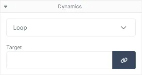
Loop Properties
Section titled “Loop Properties”| Field | Description |
|---|---|
| Target | The full name and location (if nested) of the array property within the JSON payload. |
Simple Condition
Section titled “Simple Condition”Allows the conditional rendering of the element based on a simple comparison between 2 provided values. The LHS and RHS values can be provided by directly typing the value into the text field or by clicking on the Select Parameter Target buttons and selecting the value from the JSON payload modal that appears. Click the green check button (or press the enter key) to apply the target parameter to the element.
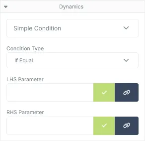
Simple Condition Properties
Section titled “Simple Condition Properties”| Field | Description |
|---|---|
| Condition Type | The type of condition used when comparing the 2 values. |
| LHS Parameter | The value of the left hand side parameter. |
| RHS Parameter | The value of the right hand side parameter. |
Available Conditions
Section titled “Available Conditions”| Type | Description |
|---|---|
| If Equal | Will render the component only if the provided values are identical. |
| If not Equal | Will render the component only if the provided values are not equal to each other. |
| If Greater | Will render the component if the LHS value is greater than the RHS value. |
| If Less | Will render the component if the LHS value is less than the RHS value. |
| If Greater or Equal | Will render the component if the LHS value is greater than or equal to the RHS value. |
| If Less or Equal | Will render the component if the LHS value is less than or equal to the RHS value. |
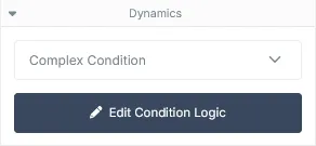
Complex Condition
Section titled “Complex Condition”Allows the conditional rendering of the element based on complex boolean logic setup through the Logic Designer. Click the Edit Condition Logic button to launch the logic designer.