Layout Elements
Layout elements provide functionality for controlling the layout of child elements within a document. Layout elements include: Pages, Sections, Rows, Columns, Page Breaks and Components.
Page Element
Section titled “Page Element”Pages form the fundamental surface onto which all visual content is rendered. A document must contain at least one page in order for it to render correctly. Pages are added using the Add Page button on the designer tool bar and hold properties used to control their size, orientation and margin content rendering.
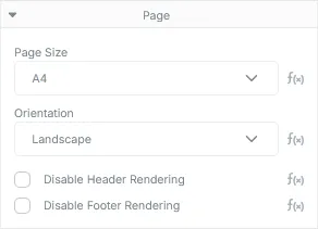
Page Element Properties
Section titled “Page Element Properties”| Type | Description |
|---|---|
| Page Size | The size of the page. See below for available sizes. |
| Orientation | The orientation of the page. Available options include Portrait (default) and Landscape. |
| Disable Header Rendering | Prevents the header element from rendering on this page. Useful for documents that require cover pages. |
| Disable Footer Rendering | Prevents the footer element from rendering on this page. |
Available Page Sizes (Width x Height)
Section titled “Available Page Sizes (Width x Height)”| Page Size | Dimensions |
|---|---|
| A0 | 2384.2 x 3370.8 |
| A1 | 1684 x 2384.2 |
| A2 | 1190.7 x 1684 |
| A3 | 842 x 1190.7 |
| A4 | 595.4 x 842 |
| A5 | 419.6 x 595.4 |
| A6 | 297.7 x 419.6 |
| A7 | 209.8 x 297.7 |
| A8 | 147.4 x 209.8 |
| A9 | 104.9 x 147.4 |
| A10 | 73.7 x 104.9 |
| B0 | 2835 x 4008.7 |
| B1 | 2004.3 x 2835 |
| B2 | 1417.5 x 2004.3 |
| B3 | 1000.8 x 1417.5 |
| B4 | 708.8 x 1000.8 |
| B5 | 499 x 708.8 |
| B6 | 354.4 x 499 |
| B7 | 249.5 x 354.4 |
| B8 | 175.8 x 249.5 |
| B9 | 124.7, x 175.8 |
| B10 | 87.9 x 124.7 |
| Executive | 522 x 756 |
| Legal | 612 x 1008 |
| Letter | 612 x 792 |
Section Element
Section titled “Section Element”Section elements are a container type layout element used to group related content together. They contain basic content layout properties.
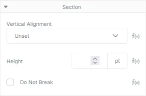
Section Element Properties
Section titled “Section Element Properties”| Type | Description |
|---|---|
| Vertical Alignment | The vertical position the Section’s content should be rendered at relative to the Section’s size. Defaults to Top. By default, Sections will match the height of their content and as a result, this property will have no effect if the height of the Section is not set. |
| Height | The height, in points, of the Section. If unset, the Section will match the height of its content. |
| Do Not Break | Instructs the renderer to ensure this Section does not split across multiple pages. If enabled, a Section that needs to be split across another page will instead be moved to the next page. Sections that are larger than their containing Page will be forced to split. |
Row Element
Section titled “Row Element”Row elements are a container type layout element used to house Column elements. Their primary purpose is to allow the layout of elements along the horizontal axis. Rows may only contain Column or Column Component elements. Row elements do not contain any properties beyond the base element.
Column Element
Section titled “Column Element”Column elements provide a container for content elements placed within a row. Like Sections and Pages, they layout their content along the vertical axis. By default, columns will share an equal portion of the available width of their containing Row element.
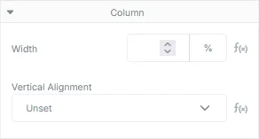
Column Element Properties
Section titled “Column Element Properties”| Type | Description |
|---|---|
| Width | The percentage of the width of the parent Row element the column should consume. By default, each column will get an equal share of the parent Row’s available width. In cases where some columns are given a specific width and others aren’t, the columns containing a width value will be distributed first, then the remaining columns without width values will be split across the remaining width of the row. Note: Supplying width values that are greater than 100% may cause rendering defects in the document. |
| Vertical Alignment | The vertical position the column’s content should be rendered at relative to the column’s size. Defaults to Top. This property will have no effect if the size of the Column is identical to the size of its content. |
Page Break Element
Section titled “Page Break Element”The page break element will cause a new page to be created each time the layout engine encounters it. All content below a page break is guaranteed to be placed on a new page. The element contains no properties and does not render any visual content.
Component Element
Section titled “Component Element”Component elements are containers for components created in the component visual designer. These elements will render their internal content and, if provided, any templated data sent in through attributes.
Component Types
Section titled “Component Types”As stated in Core Concepts, components take on the form of their root element (which may only be a layout element). As a hint, you can identify the type of component by its icon in the elements panel:
| Icon | Type |
|---|---|
 | Column Component |
 | Row Component |
 | Section Component |
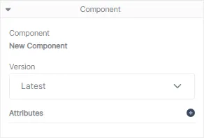
Component Properties
Section titled “Component Properties”| Type | Description |
|---|---|
| Component | The name of the component. |
| Version | The version of the component the document should use when rendering. Defaults to latest which will attempt to grab the latest published version, or, if not available, will render the current draft version. |
| Attributes | A list of name/value pair attributes that will be sent into the component during rendering. |