Creating Your First Document
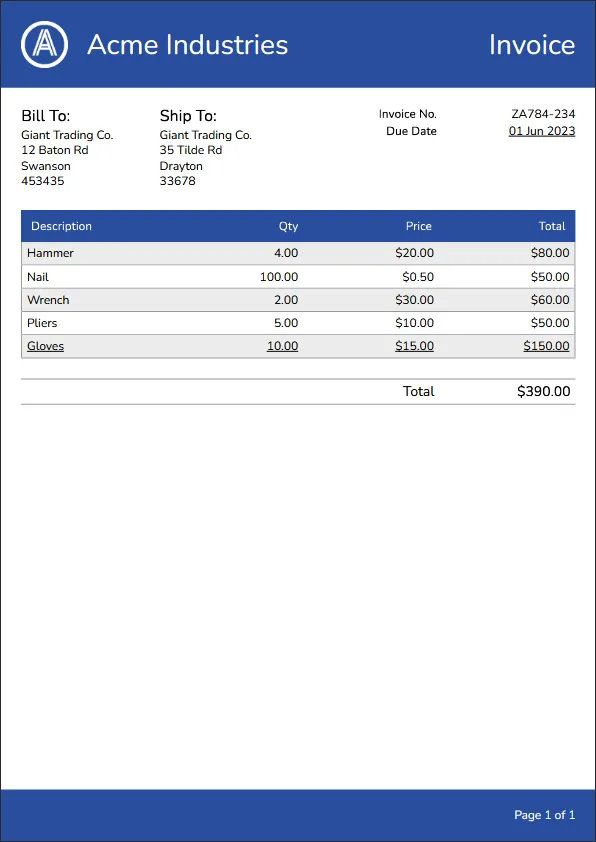
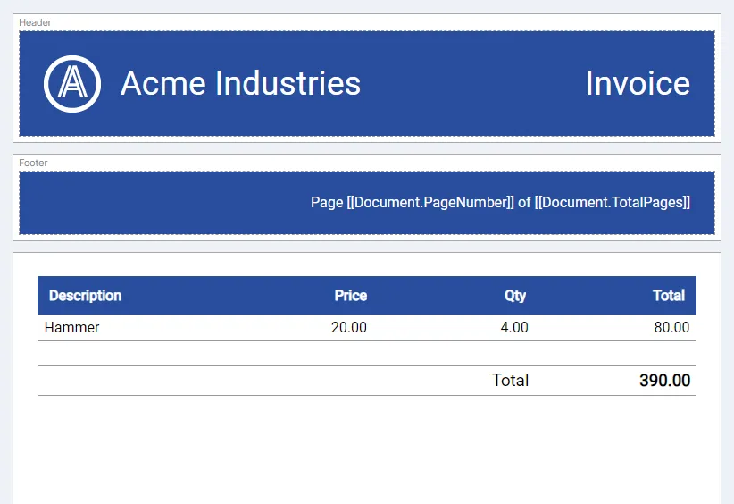
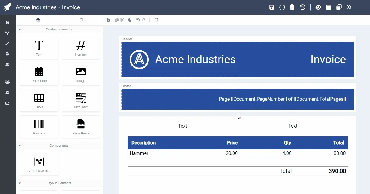
Now that you’ve been acquainted with AstraDoc’s core concepts, we can jump into actually creating a document. In this tutorial we’ll go through the process of building the following invoice:
After you’ve run through the tutorial you should have a better understanding of the following aspects:
- Working within the visual and style designers.
- Adding, arranging and modifying layout and content elements within a document.
- Building and using components and styles.
- Using the templating system to generate dynamic PDFs,
- Using attribute overrides to set the value of attributes based on certain conditions, and,
- Using the API to generate PDF files from your applications.
Let’s begin!
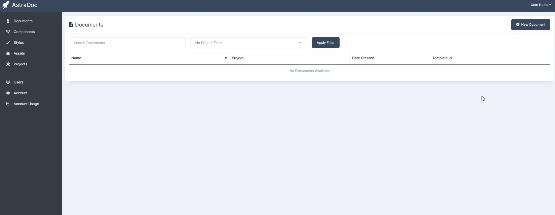
As stated in the Core Concepts page, documents need to be linked to a project, so If you haven’t already, head on over to the projects page and add a new project. Once you’ve done that, you can create a new document on the document’s page:
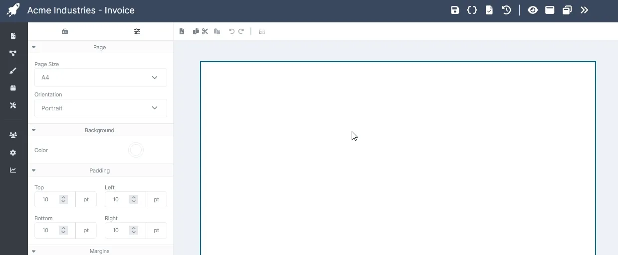
Once the document is created, it will automatically be loaded and the designer will appear along with the initial preview (currently just a single page PDF file with no content).
Understanding the Visual Designer
Section titled “Understanding the Visual Designer”The visual designer (for both documents and components) is where you’ll spend most of your time building your PDFs so it’s a good idea to have a solid understanding of its layout. The visual designer is split into 3 main sections: The top bar, the toolbox and the designer.
The Top Bar
Section titled “The Top Bar”
The top bar is divided into 2 sections. On the left is both the name of the project as well as the name of the document. Towards the center is the document and preview controls, consisting of the following buttons:
| Button | Description |
|---|---|
 | Save Document: Permanently saves any outstanding changes to the document. |
 | Set JSON Test Data: Shows the test JSON modal, allowing you to provide a test JSON payload. |
 | Publish Template: Publishes the content of the document as a discrete, immutable version. |
 | Template Publish History: Displays the template publishing history window. |
 | Update Preview: Uses the current template content and test JSON payload to generate a new PDF preview. |
 | Show Fullscreen Preview: Displays a fullscreen popup containing the current preview of the rendered PDF. |
 | Show Preview in new Tab: Pops out a new browser tab with functionality to preview the PDF. |
 | Collapse/Expand Preview Pane: Hides or shows the PDF preview pane. |
The Toolbox
Section titled “The Toolbox”The toolbox hosts both the elements that can be dropped into the document’s pages as well as their properties depending on which tab you have selected:
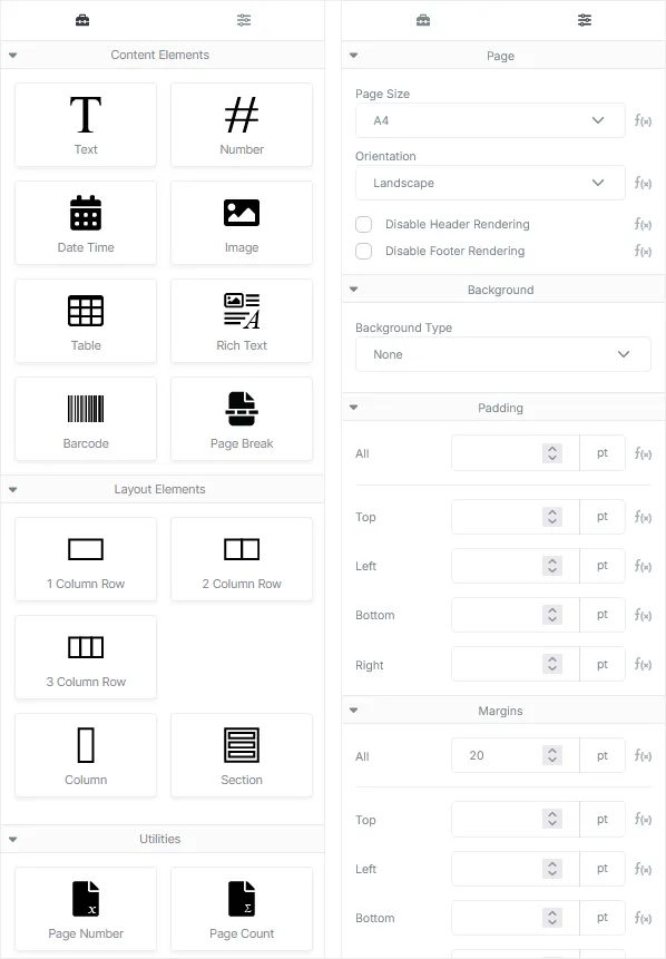
You are able to freely switch between the 2 views by clicking on the Toolbox or Properties icon located at the top of the toolbox panel.
The Designer
Section titled “The Designer”The designer is split into 3 main areas: The toolbar, the design surface and the preview pane.
The Toolbar
Section titled “The Toolbar”
The toolbar provides basic editing controls for the design surface and consists of the following buttons (moving from left to right)
| Add Page: Adds a new A4 sized page to the document. |
| Copy Selected: Copies the selected element (and their children) to the clipboard. |
| Cut Selected: Copies the selected element and their children to the clipboard and removes the element from the page. |
| Paste Into Selected: Pastes any content stored on the clipboard into the selected element. If the content in the clipboard cannot exist as a child of the selected element, the paste operation will fail. |
| Undo: Undoes the previous edit, returning the document to its previous state. |
| Redo: Redoes any undone edit. |
| Enable Outlines: Enables a persistent dashed border around all elements as a visual aid. |
The Design Surface
Section titled “The Design Surface”The design surface houses the pages in your document (as well as the header and footer if enabled) or the component surface if you’re editing a component.
The Preview Pane
Section titled “The Preview Pane”The preview pane hosts a generated PDF document preview based on the content of your template as well as the provided test JSON payload. The preview pane uses the native PDF viewing functionality of your browser so may change its behavior based on the browser used.
The preview pane may be collapsed to provide a larger design surface and may also be popped out into a new tab if multi-monitor editing is desired.
Building the Invoice
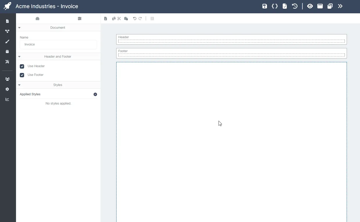
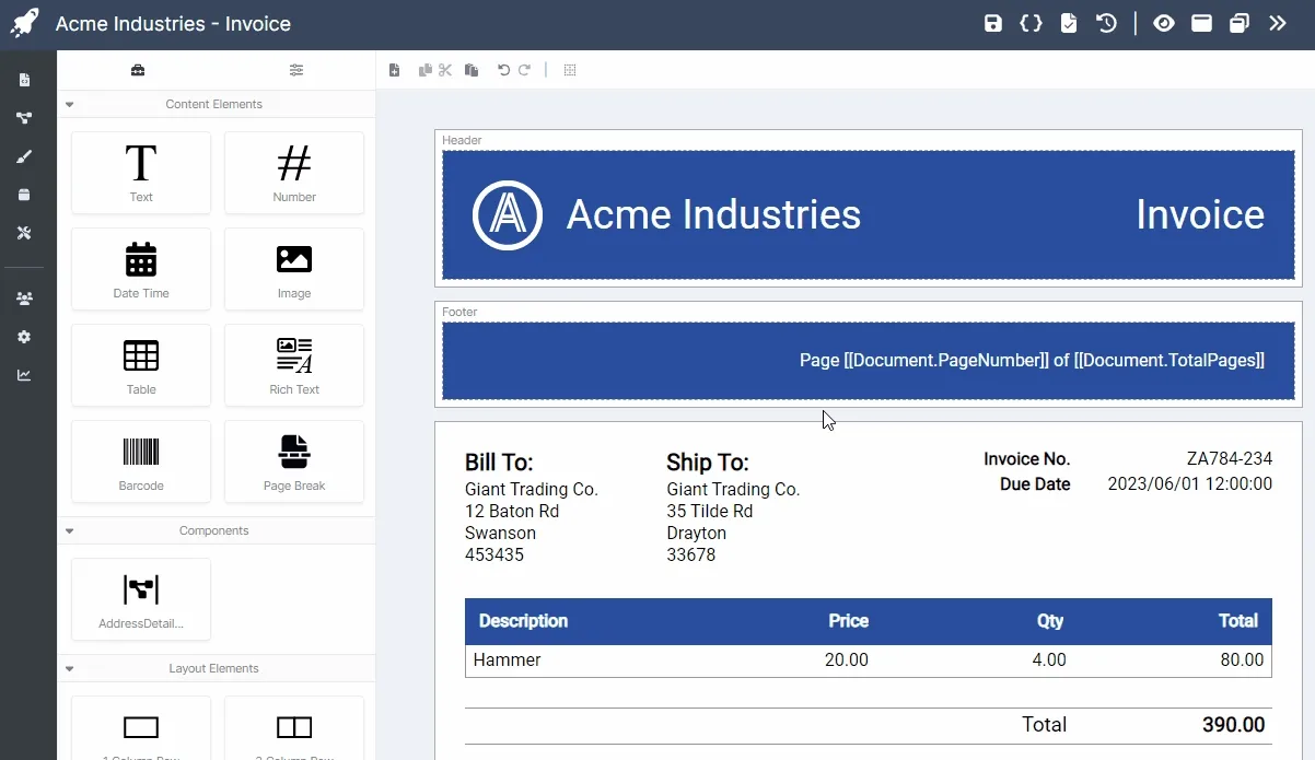
Section titled “Building the Invoice”Now that you’ve had a crash course on the visual designer we can get cracking on actually building the invoice. Our client today will be the fictional company Acme Industries, and, like most documents for large corporations, they would like a header and footer included as part of their branding, so we’ll begin there.
Headers and footers are not enabled by default, so we’ll need to add them ourselves. You can do this by clicking any empty area in the designer to deselect all elements and view the document properties, then simply check the Use Header and Use Footer checkboxes, the empty header and footer content boxes should appear above your page:
Headers and footers automatically stretch horizontally to fit the size of the page they’re being applied to.
For the header, we’ll use a 3 column row: 1 column to hold their logo, one to hold the company name and a final column to hold the name of the document. You can grab the Acme Industries logo file here
Uploading Required Assets
Section titled “Uploading Required Assets”Before you’re able to use the above image in your invoice you’ll need to upload it to your AstraDoc account as an asset. You can do this by navigating to the assets page (the icon on the left hand sidebar that looks like a box) and clicking on the Upload button on the top right of the page. A modal window will pop up providing you the option to select the project you’d like to assign the asset to (this is optional) as well as the ability to select the actual file to upload (for images, only PNG and JPG files are supported).
Once you’ve selected the file and are happy with the asset, click on the upload button to bring the asset into your account. If everything was successful, you should now see the file you’ve just uploaded in the list of assets, and it should now be available in the visual designer for the Image element.
Building the Header
Section titled “Building the Header”Now that we’ve sorted the logo out, go ahead and drag a 3 column row into the header content block:
Once dragged onto the header, a Row element containing 3 Column elements, each with their own Text element, is created. We won’t need the Text element sitting the first column since that’s where our logo will go, so you can go ahead and remove it by selecting the Text element and clicking the delete button on the element’s action panel (or simply hit the delete key on your keyboard).
The Element Action Panel:
The element action panel appears whenever you select an element and usually contains 3 primary functions: Select Parent, Move and Delete. Some of these actions may not be available depending on the context the selected element appears in.
Now that the Text element is gone, you can go ahead and drop in an Image element in its place. As a visual aid, a grey panel will appear in the top right of the element the image will be dropped in to, so make sure it says “Column” before dropping. Images have a default size, so don’t be too surprised if it appears odd at first. Select the Image element you just dropped in and in the properties panel click on the Select Asset button to display the assets modal and select the logo for the header (if the file you just uploaded does not appear, close the modal, save your document and refresh the page to give the app an opportunity to recache your assets). The image in the designer should change from the default image to the new logo.
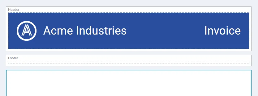
You probably can’t see the logo since it’s white on white, so let’s set the background styling of the header. We’ll start with the background color. Select the row element (either by selecting it directly or by using the Select Parent functionality on the element action panel until you have the row selected) and in the Background section of the properties panel, use the Background Type drop down to select a Color background, then click on the Color property button and in the color picker dialog, paste the following value: #294E9E, this will give the row its required background color. Finally, in the Padding section, set the All value to 20. Header background styling is now sorted.
For the company name, select the Text element in the middle column, set its value property to Acme Industries, Alignment to Left, Font Size to 28, Text Color to #FFFFFF and Left padding to 10. Finalize the company name text by setting its parent Column element Vertical Alignment property to Center.
For the name of the document, we need the same styling properties of the company name, but we don’t need to repeat the previous steps. Simply select the Text element in the third column and delete it, then, select the Text element in the second column, copy it (using the copy button in the designer toolbar or using the Ctrl+C keyboard shortcut) and, with the third column selected, paste the copied text element using the paste button in the designer toolbar or by using the Ctrl+V keyboard shortcut. Now set the Alignment property of the Text element to Right, remove the left padding value and change the value property to Invoice. Finish it off by also setting its parent Column element Vertical Alignment property to Center.
We can finish off the design of our header by selecting the column element holding the logo image and setting the Width property for the column to 10. This should last action should complete the layout for the header. Go ahead and click on the save button, then the preview button to generate preview document containing our new header.
Once the preview is available, you may notice a small issue: white bands bordering the header. The reason for this is because new pages have their padding set to 10 points by default. You can fix this by selecting the page element in the designer, clearing the values in the Padding section and regenerating the preview.
Building the Footer
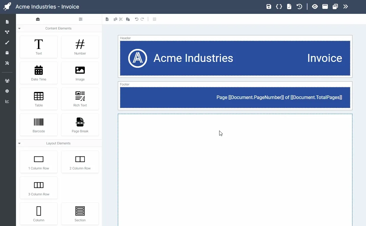
Section titled “Building the Footer”The footer is rather simple, just a single Text element that displays the current page as well as the total pages in the document. Accessing the current page number or total pages in the document is done through the use of special syntax:
[[Document.PageNumber]]And
[[Document.TotalPages]]In the utilities section within the elements panel are preset text elements containing the above syntax. You can use those, or simply drop a text element within the footer content block and set its value property to:
Page [[Document.PageNumber]] of [[Document.TotalPages]]To complete the styling for the footer, set the Alignment to Right, the Text Color to #FFFFFF, the Padding to 20 and the Background Color to #294E9E. Another update of the preview should now yield a document with both a header and a footer, ready to receive actual content.
Building the Item List
Section titled “Building the Item List”An invoice usually requires an itemized list of products or services being invoiced for. In AstraDoc there are several ways of producing a list of some kind. The easiest way is through the use of the Table element. The Table element allows you to target an array within the JSON payload from which it will automatically construct a simple table, which you can then customize to your liking.
Tables are a quick and easy way to generate list content, but they have limitations and should only be used for straight forward lists. Anything more complicated is best tackled using the Row and Column elements combined with the Loop dynamics mechanism.
To get started, let’s first provide a test JSON payload the Table element can use to build itself:
{ "invoice_no": "ZA784-234", "due_on": "2023-06-01", "total": 390.00, "items": [{ "description": "Hammer", "qty": 4, "price": 20.00, "total": 80.00 },{ "description": "Nail", "qty": 100, "price": 0.5, "total": 50 },{ "description": "Wrench", "qty": 2, "price": 30.00, "total": 60.00 },{ "description": "Pliers", "qty": 5, "price": 10.00, "total": 50.00 },{ "description": "Gloves", "qty": 10, "price": 15.00, "total": 150.00 }], "billing_address": { "name": "Giant Trading Co.", "line1": "12 Baton Rd", "line2": "Swanson", "postal_code": "453435" }, "shipping_address": { "name": "Giant Trading Co.", "line1": "35 Tilde Rd", "line2": "Drayton", "postal_code": "33678" }}Open up the test JSON payload modal and paste the above code into the text block provided, then click apply.
We’re now ready to add the table, but before we do that, we need to add some padding to ensure page content doesn’t sit right up against the edge of the page (if you remember, we removed page padding earlier to allow the header and footer to appear correctly).
We’ll fix padding on the page by dropping in a Section element that will become the container into which all subsequent content will be dropped. We can then provide 20 point Padding on all sides of the Section element ensuring that all the content on our page is spaced correctly. Go ahead and drop that Section element directly onto the page now and set its Padding to 20.
Once that’s completed, drop the Table element into the new Section, you’ll see a message stating: Set Data Source to View Table Contents. This means the table has not been hooked up to an array in the JSON payload and can’t render its content. To fix this, select the Table element, and in the Data Source property click on the Set Data Source button, this will pop a modal up which will show a list of available arrays in the JSON payload that can be used as a data source, select the items array and then click the OK button, the table should automatically populate the rows and columns with data:
The dynamics Loop mechanism will always attempt to render the first item in the array within the designer, you’ll need to refresh the PDF preview to view all the items in the array rendered out.
You’ll notice that the Table element has created a table header and rows as well as columns for each property in the objects within the array, it will also attempt to match the best element used to render that property. You can change the element type as well as the order of the columns by manipulating the columns in the Table Columns panel:
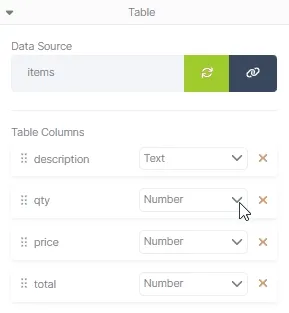
Styling for the Table element is largely similar to styling the header and footer. For the table header, select the Header Row element (remember to use the Select Parent button on a child element if you can’t select it directly) and set the Padding to 20, then set the Background Color to #294E9E. For the individual header Text elements, select each of them and simply change their Text Color properties to #FFFFFF, then change their values to something more visually appealing since they’re currently set to the name of the object properties they’re based on. Finally, set the Alignment to Right for all numerical columns.
For the table body, select the Body Row element, set its Padding to 5, and then set its Left, Bottom and Right Borders to a Width of 1 point and a Color of #999999. The reason we don’t set the top border is because border elements can double up when adjacent to each other, meaning the top and bottom borders for each row will render out their own border, making them appear thicker than they should. We can finalize the styling for the table by setting all Number elements within the row to Right aligned as we did with the header elements.
Styling the Alternating Rows with Dynamic Attribute Overrides
Section titled “Styling the Alternating Rows with Dynamic Attribute Overrides”Acme Industries want the rows of their invoices to alternate in color in order to make the invoice items clearer for larger invoices. We can apply this effect using Dynamic Attribute Overrides. Attribute overrides allow you to change the final value of an element’s attribute based on a certain condition. In this instance, we want the Background Color of the table’s Body Row element to take on a certain color when the index of that row is an even number.
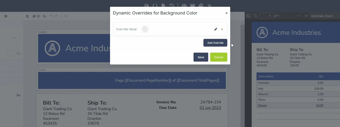
To do this, select the Body Row element for the table and under the Background property group, set the Background Type property to Color, then click the f(x) icon next to the color swatch to display the Dynamic Overrides Modal, once the modal is visible, click the Add Override button. A new override should appear in the list, click on the color swatch for the override and set its color to #ECECEC. If the logic for the override evaluates to true, the Background Color property will be set to the given override value.
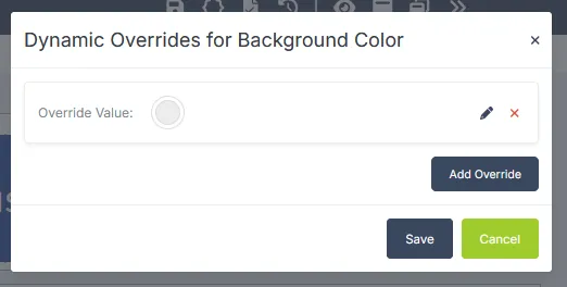
To actually set the logic, we need to use the logic designer. Click on the Edit Override Logic pencil icon to display the override logic designer. The logic designer allows you to build complex boolean logic that resolves to true or false. For now, we need a relatively simple boolean function to enable this override: is the index of an item in the loop an even number? Once the logic designer is visible, select the drop down menu for the Root Condition Group at the top right and click on the Add Condition menu item. On the new Condition item, click the select list that currently says Is Equal To and change its value to Item Index is Even and then click the Save buttons in both the logic designer modal as well as the dynamic overrides modal.
Updating the PDF preview should now display a PDF with rows of alternating colors in the items table. You should also notice the f(x) icon for the Background Color property is now darker than the surrounding f(x) icons in the properties panel. This indicates that the given property currently has dynamic overrides applied to it.
Completing the Invoice Items
Section titled “Completing the Invoice Items”Let’s complete the invoice items content by creating a row that displays the total for the invoice. Start by dropping a 2 column row into the Section element just below the table. Select the new Row element and set its Top Margin to 20 to provide spacing between the row and table above, then set its Padding to 5 and its Top and Bottom Borders to a Width of 1 and Color of #999999. By default Column elements are created with Text elements inside them, but for the actual total column we need a Number element, so go ahead and delete the Text element in the 2nd column and drop a Number element in its place. For both Text and Number elements set their Text Size to 14 and their Alignments to Right, then set the Number element holding the total to bold. For their values, set the Text element to the value of “Total” and the Number element to the total property in the JSON payload:
{{total}}One last thing remains before we can check off the invoice items content: Align the totals columns. To do this, select either the table Header Column or Body Column elements for both the ‘Total’ and ‘Qty’ columns and set their Width properties to 25. Header and Body column elements will automatically adjust to fit the size given to the other, so you only need to set one and the other will change as well. Once that’s complete, select the 2nd column in the row displaying the invoice total and set its Width property to 25 as well, the columns should now line up correctly:
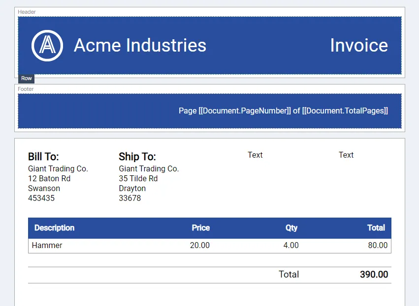
The invoice needs one final aspect before it’s completed: details about the invoice i.e. the invoice number, due date as well as shipping and billing address details. Since the shipping and billing details have the same data structure, we can use a component to render the information instead of duplicating the required elements.
Building the Address Component
Section titled “Building the Address Component”Components are a great means of reducing duplicate effort when building your documents. We’ll demonstrate this by creating a component that will consume all the info we need for holding the billing and shipping details, as well as a title to ensure that people know what address type they’re looking at.
Start off by heading over to the components page and creating a new component. Name the component AddressDetails and ensure it’s assigned to the same project as the invoice you’re building since documents are only able to access components within the same project.
Once you’ve created the component, you’ll be presented with the visual designer containing a basic Section element with a Text element as its child. As stated in the Core Concepts chapter, components take on the form of their root element and their root element may only be a layout element such as a Section, a Row or a Column. Since our ultimate goal is to place 2 of these alongside one another, a Section component is not the right type of component we want, we need a Column component that can be dropped into a Row element, so go ahead and delete the Section element and drop a Column element in its place. This is now a Column component.
We can see by the payload that we need 4 pieces of info for our address details component: The name of the entity being invoiced, the 1st and 2nd lines of the address and the postal code. We’ll add an additional title field in order to change the title of the component. We already have a Text element created by default for the column, so drop another 4 more Text elements underneath the existing Text element.
Setting up the Data
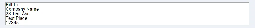
Section titled “Setting up the Data”Since the component will be dynamic, let’s create a test payload we can use to preview our component. Open up the test JSON modal and paste the following JSON into the editor and then hit the apply button:
{ "title": "Bill To:", "companyName": "Company Name", "line1": "23 Test Ave", "line2": "Test Place", "postalCode": "12345"}We’ll need to pass each one of the above properties (and their values) in as attributes when we drop the component into the document.
For now go ahead and assign each Text element in the component the value of one the properties using the moustache syntax you used earlier to set the total for the invoice e.g. {{title}}.
Once completed, you should have a component that renders each of the properties in the payload:
We can now style the component. For the title field, set the Text Style to Bold, Alignment to Left, Font Size to 16 and a Bottom Margin of 5. For each of the remaining Text elements, simply set their Bottom Margins to 3. And that’s it, generate a preview and if everything looks good, save the component and let’s head back to the document to drop it in. Remember, if a component you’ve added does not appear in the components list, save your document and refresh the page to give the designer a chance to find any recently added components.
The new component elements begin with their property values unset, we can set them by selecting the component and adding attributes to it. The attribute name should be the same as the JSON payload property name, and the value can be a string literal or a reference to a JSON payload property using moustache syntax. Select the component in the first column and add a new attribute with the name of title and value of Bill To:. The component in the designer should update to reflect the new value. In order to set the value for the companyName field, add another attribute with the name of companyName and give it the value of:
{{billing_address.name}}This will wire it up to the JSON payload attached to the document. Go through each of the properties for the component and add the correct attribute names and values for them for both the billing and shipping details, matching them to the correct property within the JSON payload for the document. You should end up with a document similar to the following:
Finishing off the Document
Section titled “Finishing off the Document”We can now finalize the content of the document by pulling in the last 2 remaining aspects: The invoice number and due date. For the invoice number, we can utilize the existing Text elements already in the last 2 columns. For the label, set the value of the Text element in the 3rd column to Invoice No., its Text Style to Bold, its Alignment to Right and its Bottom Margin property to 5.
For the invoice number value, select the Text element in the 4th column and set its Alignment to Right, its Bottom Margin to 5 and its value to:
{{invoice_no}}Matching the invoice number property in the test JSON payload.
To add the due date, select the existing Text element in the 3rd column, copy it using the Ctrl-C keyboard shortcut, then select its parent Column and paste with the Ctrl-V shortcut, then go ahead and change its value from Invoice No to Due Date. For the actual date value element, drag in a Date Time element from the elements panel just below the invoice number element in the 4th column. Finish it off by setting its Alignment to Right and its value to:
{{due_on}}And that completes the content of the document. However, there is one small problem: styling. The font family, currency and date formats don’t align with Acme Industries branding and we need to fix it. We can go and adjust each element individually, but that would take some effort and would mean we’d have to do it each time we created a new document, so we’ll create a Style instead and apply it to the document.
Head on over to the Styles page and create a new style and assign it to the right project. As with components, documents are only able to access styles within the same project. Once your style is created, you’ll be presented with the Style Designer.
Understanding the Style Designer
Section titled “Understanding the Style Designer”Like the Visual Designer, the Style Designer is split into several sections: The top bar, the style explorer and the style properties panel.
The Style Designer Top Bar
Section titled “The Style Designer Top Bar”
The top bar for the Style Designer is also split into 2 main sections: the style and project name on the left and the style controls on the right
The style controls on the right include the following buttons:
| Button | Description |
|---|---|
| Save Style: Permanently saves all changes to the style. |
 | Edit Style Properties: Shows the Style Properties modal, allowing you to edit its name and project. |
| Publish Style: Publishes the style configuration as a discrete, immutable version. |
| Style Publish History: Displays the style publishing history window. |
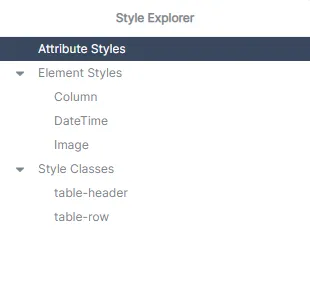
The Style Explorer
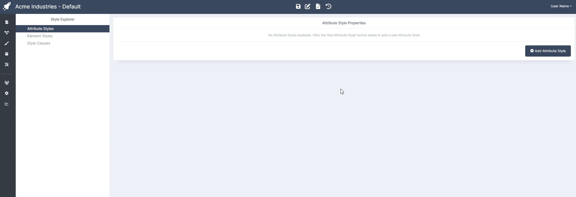
Section titled “The Style Explorer”The style explorer panel hosts the style types implemented on the style. As stated in Core Concepts, there are several style types: Attribute Styles, Element Styles and Class Styles. Each of the style types added to the style will appear in the explorer, it will also provide functionality for you to add and remove style types.
The Style Properties Panel
Section titled “The Style Properties Panel”The style properties panel holds all the properties added to the style type that’s been selected in the style explorer. Through the style properties panel you’ll add the different style properties and set their values.
Building the Style
Section titled “Building the Style”In order to fix the styling issues with the document we need to do 4 things
- Set the correct font family for all text elements (Nunito).
- Set the correct date formats for all
Date Timeelements. - Create a class we can apply to
Numberelements holding financial amounts so they conform to the correct format, and, - Create a class to underline the elements within an invoice item row.
Setting the Font Family
Section titled “Setting the Font Family”The font family for Acme Industries is Nunito, so all text that appears in their generated documents need to be Nunito, regardless of what the purpose of the text in the document is. Attribute Styles work best for global defaults like this, when an attribute style property is set, any element in the document that consumes that property will have it applied by default, and since all text elements consume the Font Family property, adding a Font Family property as an attribute style will ensure all text in the document automatically has the correct font family.
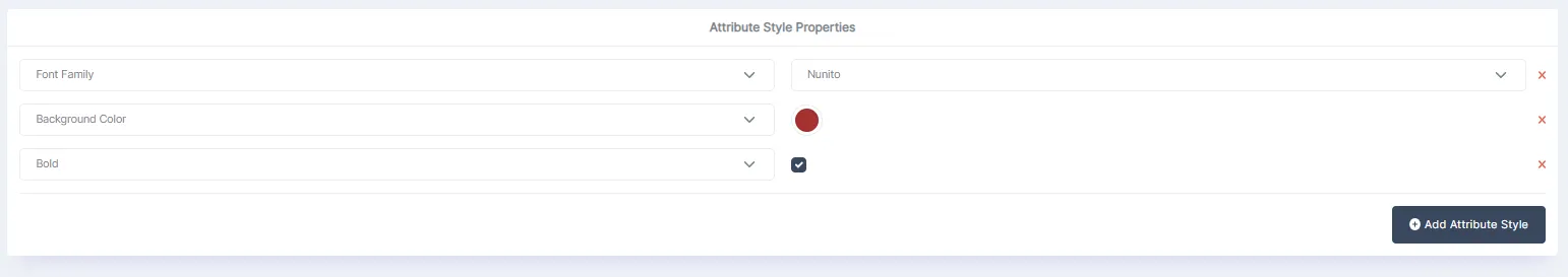
To set the Font Family attribute style property, select the Attributes Style item in the Style Explorer, then click on the Add Attribute Style button in the style properties panel, a new property will be added. Use the dropdown to set the property to Font Family, then set the value to Nunito in the provided font list drop down.
Setting the Correct Date Format
Section titled “Setting the Correct Date Format”Acme Industries uses the (day) (abbreviated month) (year) format for their documents e.g. 04 Jan 2020. To ensure this is the format used going forward, we’ll add an element style for the Date Time element and set its Format property to the correct format. They also underline all of their dates, so we’ll add this property as well. Properties added to element styles only apply to the specified element and nothing else.
To add an element style for the Date Time element, hover your mouse over the Element Styles item in the style explorer and then click on the small blue plus icon that appears when your mouse hovers over the item. This will add a new element style that defaults to the Column element. Click on this new element style in the style explorer and in the drop down that appears in the style properties panel, change it from Column to Date Time.
To finish off the Date Time element style, add 2 new style attributes by clicking the Add Attribute Style button. Set the first property to Date Format and its value to:
dd MMM yyyySet the second property to Underline and ensure the checkbox associated with the property is checked. Go ahead and save the style.
Setting the Currency Format
Section titled “Setting the Currency Format”Next, let’s add a new Style Class that we can set on specific Number elements used for displaying financial values. Use the Style Explorer to add a new Style Class, select the new Style Class in the explorer and rename it from NewStyleClass to currency. Add 2 new attributes, set the first attribute to Prefix and give it a value of $ (or any other currency symbol you’d like), for the 2nd attribute, set it to Thousands Separator and set its value to a comma character: ,.
Creating the Importance Class
Section titled “Creating the Importance Class”We’ll finish off the style by adding a new Style Class that will underline all text elements in the invoice item row. We need to do this because Acme Industries deems any invoice that has items with a quantity of 10 or more and a total value of $100.00 or more as important and needing of attention and underlining all items of an invoice that meet this criteria is a good way of getting this attention. Go ahead and add a new Style Class and give it the name important. Add a new Attribute Style to this Style Class and set it to Underline. Make sure both the value checkbox and the Cascades checkbox is checked as well. We’ll apply this style to the Table Row element and have it cascade down to all text element children contained within it.
The style is now complete, click on the save button to save the changes and let’s head back to the document to apply our new style.
Integrating the Style
Section titled “Integrating the Style”We add a style to a document through the Document properties panel. Make sure no element in the document is selected, then head over to the properties panel and in the Styles section click the blue plus icon to add the style, a drop down will appear with a list of available styles to add, select the style you just created (we named our style Default) then click the Add Button, the document should immediately update to reflect the new styling. If the style does not appear in the list, save your document and refresh the page to allow the app to refresh its style cache.
Let’s wrap things up by applying our currency class to the number elements holding financial values: the price element in the 2nd column of the table, the total element in the last column of the table and the invoice total element below the table.
Click on each of the Number elements listed above and in their properties panel, scroll to the Misc. section and in the Style Class input, enter the value of currency and hit the enter key. Each of the financial values should now have the correct styling.
Finally, let’s go ahead and ensure that any invoice item row that has quantity of ten or more items, as well as a total value of $100.00 or more has the important Style Class applied to it. In order for us to do this, we’ll need to selectively apply the important class to the Table Row element. Not every row needs to have this class, only the rows that meet the criteria above. We can do this with Dynamic Attribute Overrides again, just like we did with the alternating rows. This time, our logic will be a little more complex.
Select the invoice item Table’s Table Row element and, in the Misc properties panel, click the f(x) icon for the Style Class property to bring up the dynamic attribute overrides modal. Add new override and set its value to important then go ahead and click the pencil icon to launch the logic designer modal. With the modal open add 2 new Conditions using the popup menu in the top right as you did before. Ensure the Root Condition Group boolean operator type is set to And and for both conditions set the comparison type to Is Greater or Equal To. For the first condition, set the LHS value to qty, pointing to the qty property of the JSON object in the items array and set the RHS value to 10. For the second condition set its LHS value to total and its RHS value to 100. Then, click the save buttons for both the logic designer modal as well as the attribute overrides modal.
What we did there was ensure that whenever the qty value is 10 or more AND the total value is 100 or more, apply the important Style Class to the Table Row. Updating the PDF preview should now show that the Gloves invoice item has all of its values underlined because its Quantity is 10 and its Total is $150.00, satisfying the criteria for important items as defined above.
And that’s that for the document, the only thing left to do now is generate a PDF of the document using the API.
Generating PDFs using the API
Section titled “Generating PDFs using the API”Once your app is ready to actually start generating PDFs, you can use the AstraDoc API to submit a request to the generate document API endpoint containing a JSON payload that matches the payload provided by you in the test JSON modal. If successful, the response returned will include a base64 string containing the fully rendered PDF file.
To demonstrate this, we’ll create a Javascript Node.js application that will generate the invoice we’ve just created. We chose Javascript because of its ubiquity, but the AstraDoc API is fully REST and JSON compliant so any language and framework capable of making HTTP requests and handling JSON data will do fine. Let’s begin.
Prerequisites
Section titled “Prerequisites”Before we begin generating our documents via the API, we need to get a hold of 3 primary pieces of data: Your API key, the document Template Id and the template version you’d like to generate.
Your API Key
Section titled “Your API Key”The API key is used to authenticate your account with the AstraDoc API. You can find your API key in the Account Details panel of the Accounts page. This page is only accessible to admins so if you aren’t able to access it, you will need to ask the individual that has admin access to retrieve it for you:

The Template ID
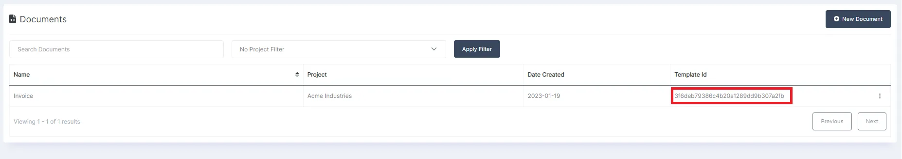
Section titled “The Template ID”The template Id is used to identify the template on your account that you’d like to use to generate the PDF documents. You can find the template Id on the documents page, every document in the list will have its template Id in the last column:
The Template Version
Section titled “The Template Version”The final piece of required data is the template version you’d like to generate. For dev, QA and staging environments you would usually use the value of draft. This will ensure that the document generated through the API always matches the document you see in the visual designer.
However, for live systems this may not always be appropriate. If a live system is currently generating on a draft document and the draft document changes before the live system is updated, the document on the live system may render incorrectly. This is why it’s considered a good idea to publish your documents before they go live then target the latest version of the template when generating documents on your live system. This will allow you to edit the draft template while keeping the live system isolated from the change until you’re ready to deploy.
By default, the API will always attempt to generate the latest published version of your document. This means that on live versions of your system, you can generally leave the template version property blank. However, if you leave the template version property blank and there is no published version available, the API will return a 404 Not Found error.
Building the Request
Section titled “Building the Request”We’ll be using the Javascript Fetch API to make the request to the AstraDoc service. First, let’s setup the payload. For this test, we can simply use the payload we provided to the test JSON modal, but in the real world, your payload would be generated from some data source. The generate document API takes the template data as a serialized JSON object string:
const payload = {    "invoice_no": "ZA784-234",    "due_on": "2023-06-01",    "total": 130.00,    "items": [{        "description": "Hammer",        "qty": 4,        "price": 20.00,        "total": 80.00    },{        "description": "Nail",        "qty": 100,        "price": 0.5,        "total": 50    }],    "billing_address": {        "name": "Giant Trading Co.",        "line1": "12 Baton Rd",        "line2": "Swanson",        "postal_code": "453435"    },    "shipping_address": {        "name": "Giant Trading Co.",        "line1": "35 Tilde Rd",        "line2": "Drayton",        "postal_code": "33678"    }}
//convert the JSON data used to render our document into a stringconst templateData = JSON.stringify(payload);
Now we can build the request payload we’ll be sending to the AstraDoc API:
const requestData = { templateData: templateData, templateId: "insert the template Id for your document", templateVersion: "draft" //we want to generate the document that's sitting in the designer};We can finish off the request by building the request object and posting the request to the AstraDoc API:
const options = {    method: "post",    body: JSON.stringify(requestData),    headers: {        "Content-Type": "application/json",        "Authorization": "insert your API key as a string here"    }}
const result = await fetch("https://api.astradoc.io/documents/v1.0/GenerateDocument", options);
if(result.ok) {    const generatedData = await result.json();    const pdfBase64 = generatedData.Data;}
If the request is successful the response body will contain a payload with a base64 string holding the contents of the PDF file.
And that’s it! Congratulations on generating your first document! There’s still plenty more to learn and understand about AstraDoc though. You can start by running through the individual docs for each of the elements available to you through the visual designer, then take a look at the various API end points available, finally, for the admins, finish off by getting a better understanding of how to manage your AstraDoc account.